Personal Brand
My personal rebrand has been a meaningful and intentional journey—one that unfolded gradually but ultimately feels deeply authentic to who I am. I wanted my brand to embody qualities that are professional, classic, and timeless, while weaving in subtle heritage elements that reflect my story.
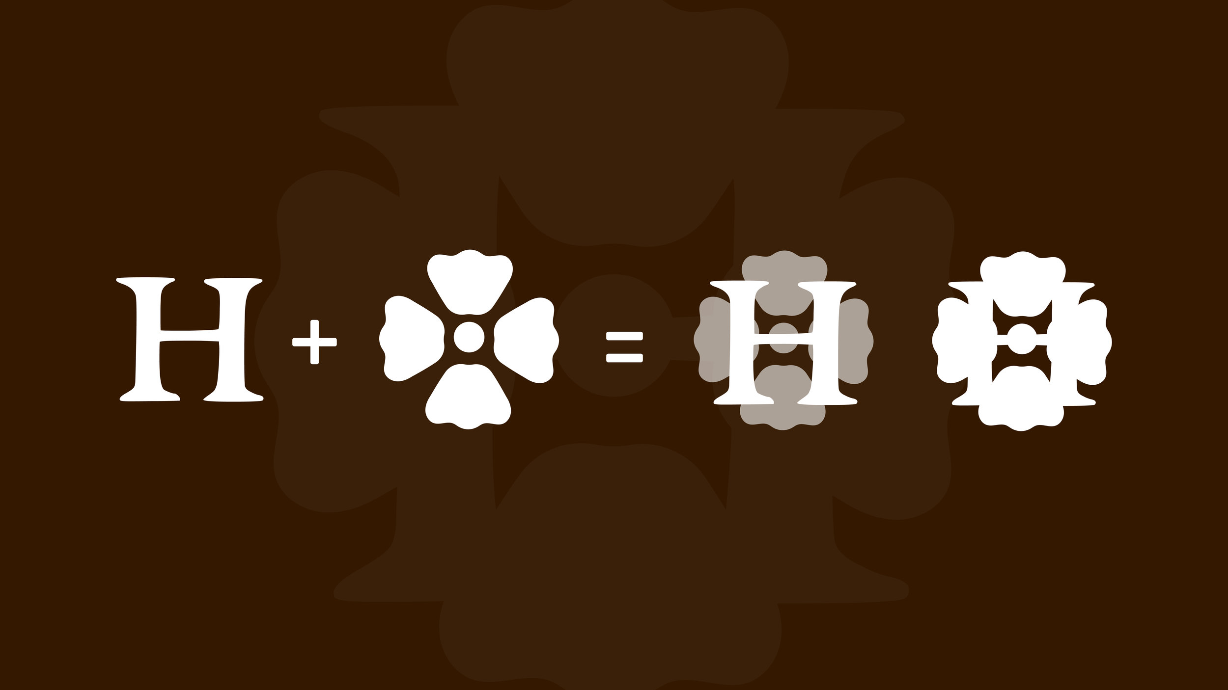
At the heart of my new logomark is a capital “H” from my last name, overlaid with a flower. Flowers have always inspired me—they can be soft, bold, and delicate all at once. By merging these elements, I created a mark that feels both strong and graceful, a true representation of my identity. This motif extends into patterns and wallpaper graphics featured throughout my website, bringing consistency and artistry to the brand experience.
Every design choice was made with care. My color palette is warm, soft, and inviting—echoing the tones I use in my home to create a sense of comfort and ease. For typography, I paired the clean, modern lines of Brandon Grotesque with the timeless elegance of Baskerville, creating balance between contemporary clarity and classic sophistication.
The result is a brand that not only represents me but also feels like an extension of my creativity, my values, and my personal style—something I’m proud to share.